
Combining Cloud Dancer
Taking inspiration from Pantone palettes to create a planting design for a border or the garden

The Pantone Institute likes to give us a little help, by providing a few palettes that provide inspiration around using the colour of the year. A starting point or two, for anyone who likes the colour but isn’t too sure how to use it or what to pair it with.
The palettes have been designed with fashion and interior design in mind, but there is no reason not to take them outside and apply them to the garden. This year they have provided seven palettes, some of them, I think will work better in the garden than others. Both in terms of plant and flower colours, and hard landscaping with tones of grey and buff.
Light and Shadow
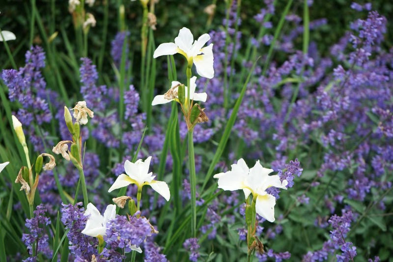
The first of the palettes, and probably my favourite is Light and Shadow. Partly due to the name, light and shadow is something I look for in any garden. Where will the sun be in the evening to sit out and enjoy a glass of wine, or where will the shade be to eat lunch in the midday heat. A chance to see or create a patch of dappled shade, watching the sun filter through the leaves, lighting up pockets of the garden while highlighting the shaded areas.
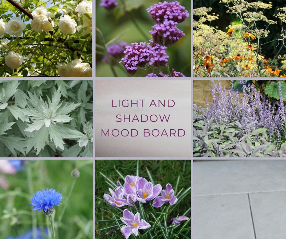
The colours in this palette appeal as a planting design, mixing pale greens and golds with dark blues and violet. Here are just a few ideas,
